Many families didn’t know what ArboTerra was, and the client wanted one concept to define it. The answer was not to: the park is something different for every visitor, so the sentence stays open. I created the concept, four 3D key visuals and the AdBook the client’s team still produces with.
- Role
- Concept, key visuals, 3D
- Scope
- Concept only · execution in-house
- Agency
- Happy Studio
- Timeline
- 2–3 months
- Result
- Still in use, 3 years on








A park nobodycould define
ArboTerra, a nature park in Puebla, needed a campaign to introduce itself: many families didn’t know what it was. The brief asked for a single concept to sum the park up.
Parents and kids, with very different reasons to visit.
Billboards and a steady stream of social content.
Don’t define it.Let it be everything.
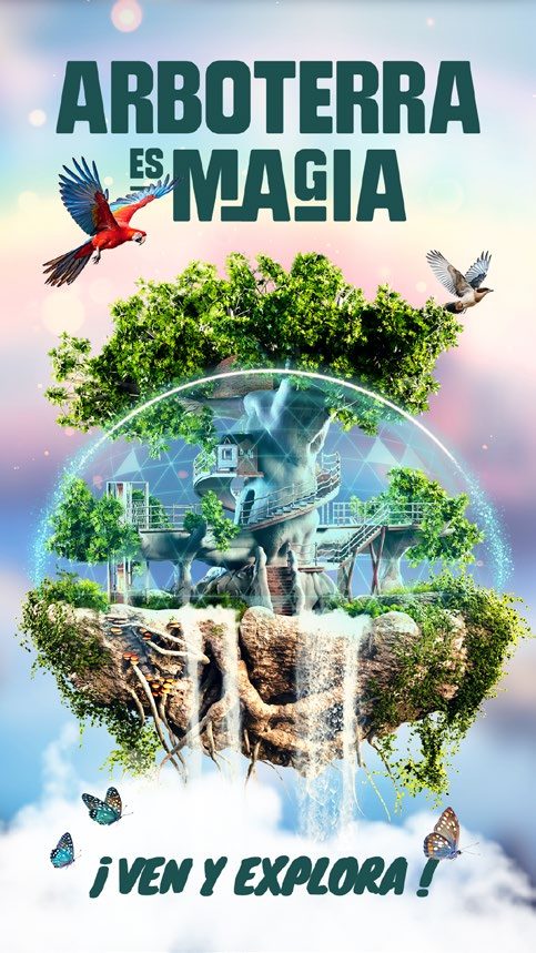
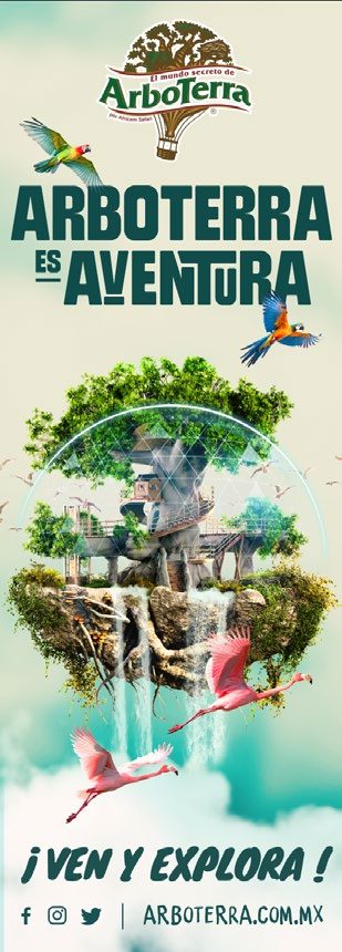
Any single definition would leave most of the park out. So the line never ends: ArboTerra es… adventure, fun or magic, depending on who visits and what they do there. A kid finds adventure; a parent finds learning.
The client wanted something timeless. An open sentence gives them a campaign that never runs out of endings, and the freedom to say whatever the park needs next.
The road not taken
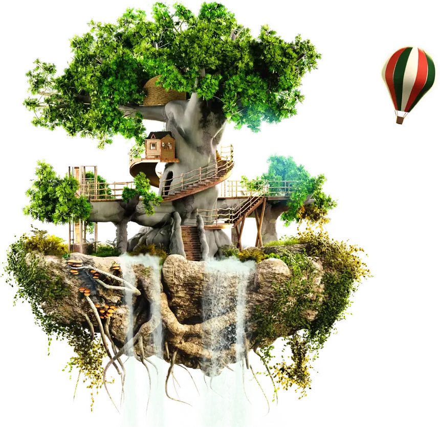
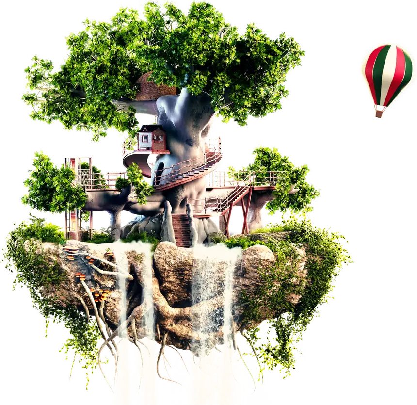
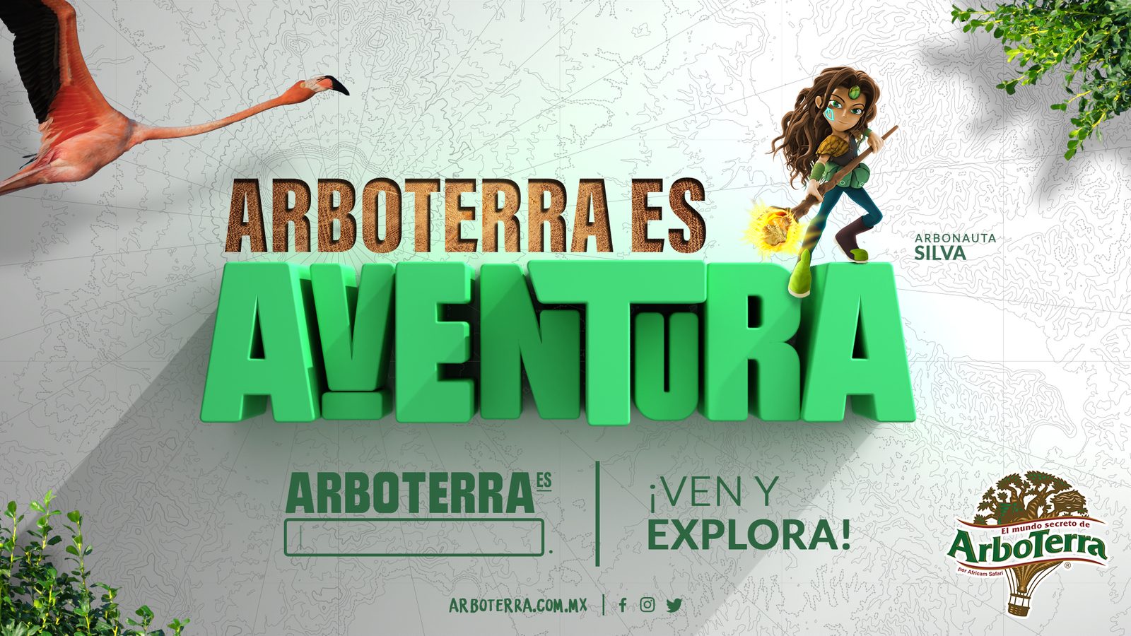
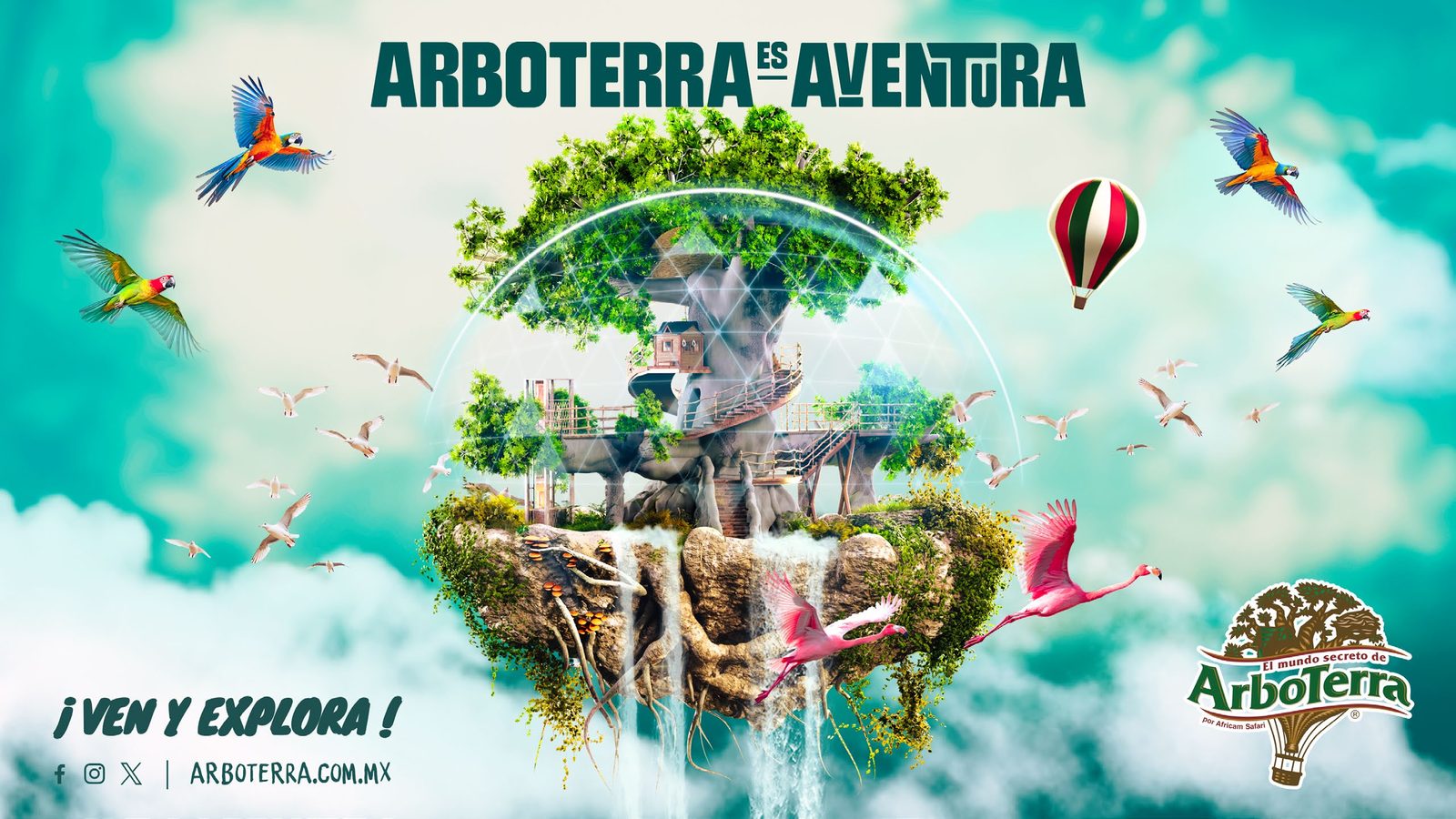
The white route, with mascots and 3D letters, looked like any other park. The floating tree belongs only to ArboTerra and works with every ending. Drag to compare.
Building theÁrbol Arcano
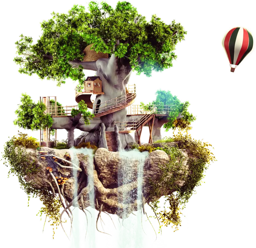
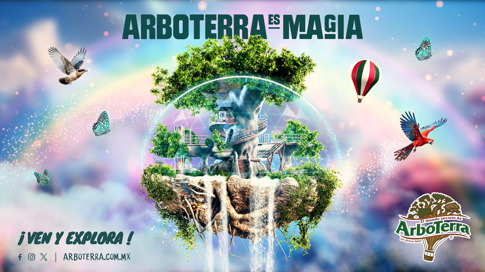
One hero element, modeled in Blender and composed in Photoshop. The hardest part of the project.
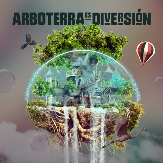
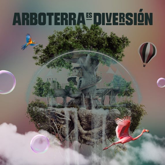
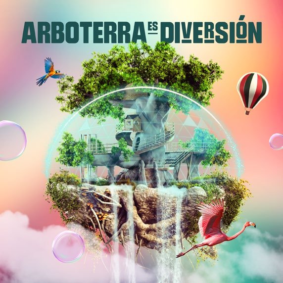
Photo, blurred and color-graded to match the word.
The 3D tree: a floating island with a waterfall and a balloon.
Birds from the park, bubbles and light.
Lockup and call to action: ¡Ven y explora!
From the AdBook: the layer in color is the one being added.
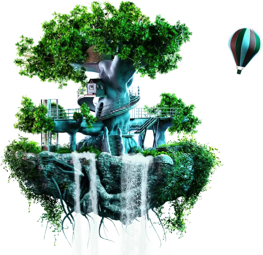
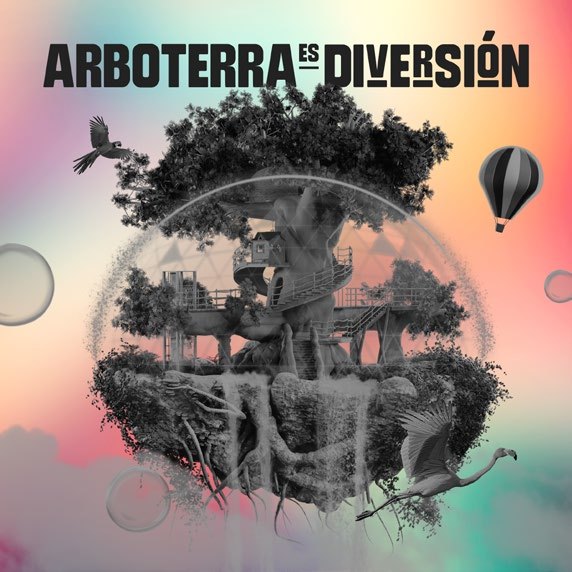
Same tree, four moods
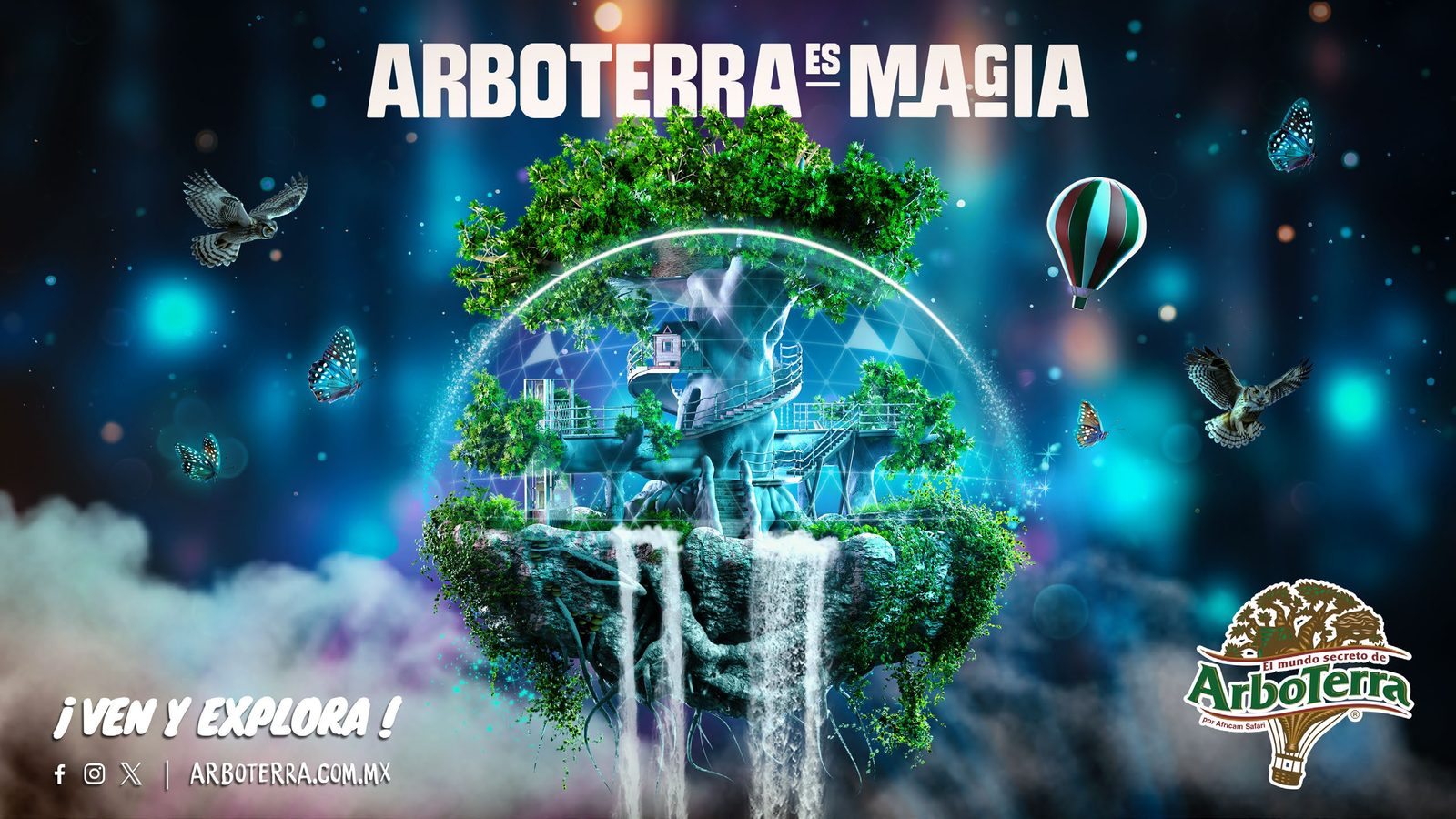
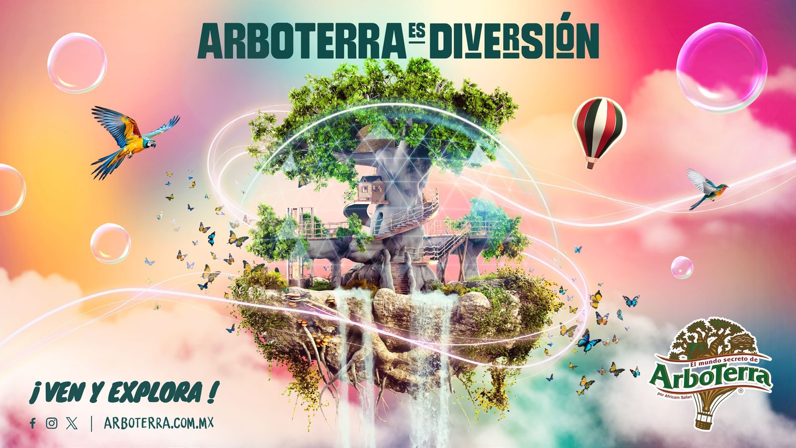
Different moods, built from photos
Each word gets its own background: a real photo, blurred, then color-graded to match the feeling. Hover to open each one.
A toolkit,not a poster
We only created the concept; the client’s in-house team would run production. So the deliverable was a 35-page AdBook: four backgrounds, the tree, supporting elements, type and layer rules, enough to build any new piece without the agency.
Sorvette for the big words
Rounded block letters with small cut-in details, so every word feels hand-built.
Knewave for the call to action
A loose brush script that shouts ¡Ven y explora! without competing with the title.
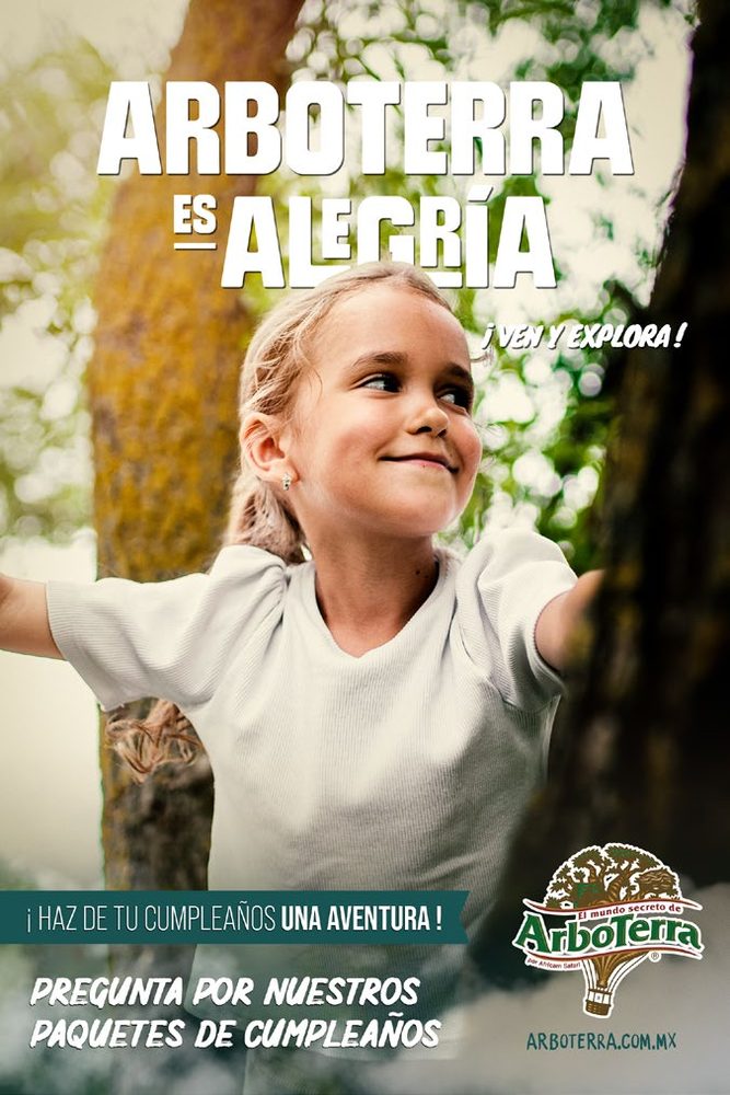
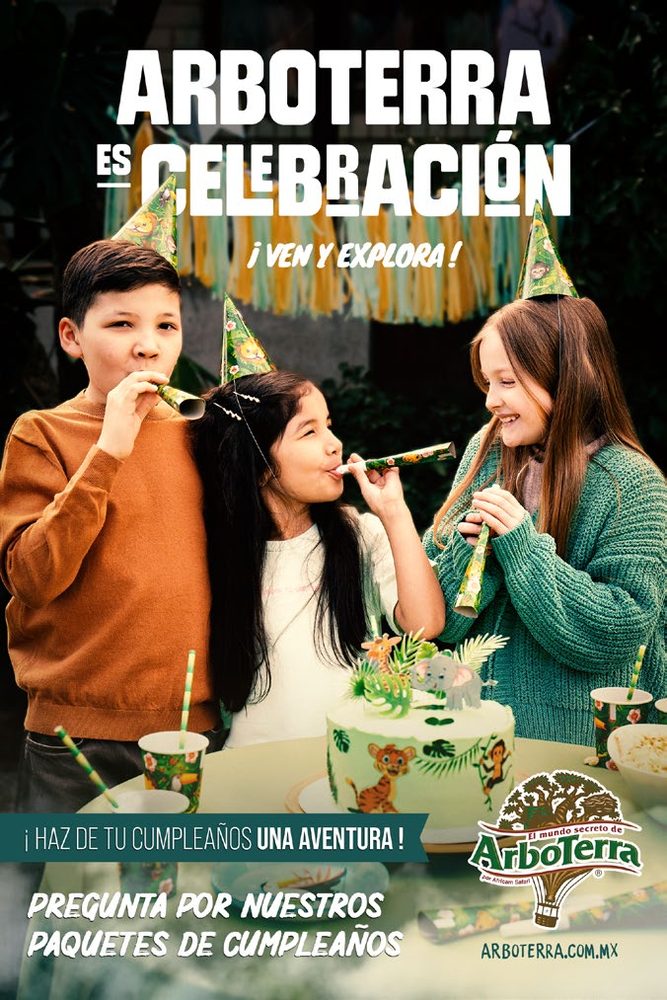
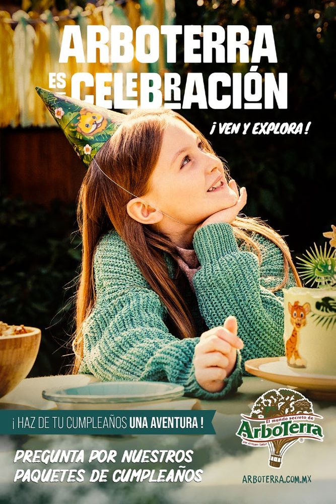
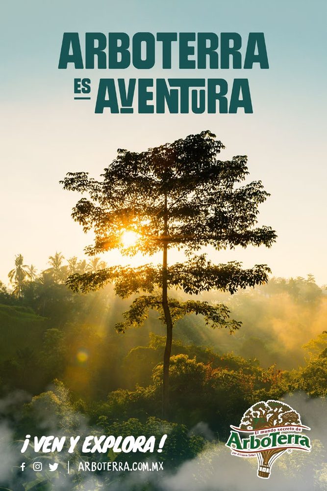
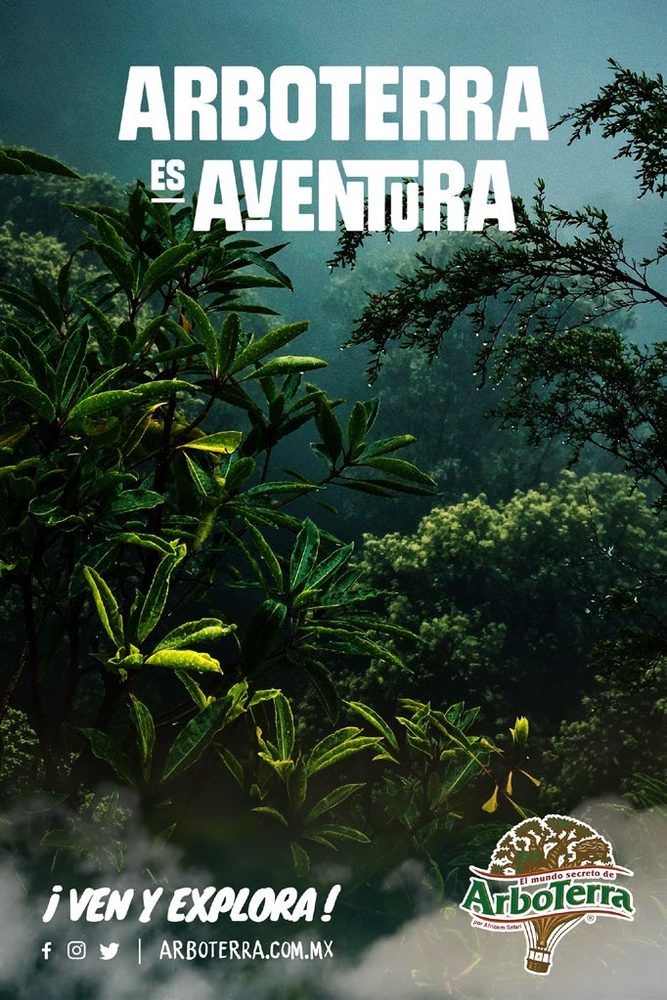
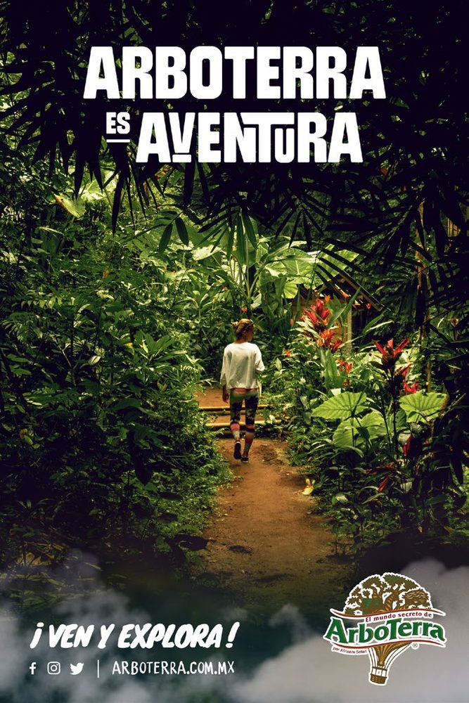
Three years later,still ArboTerra es…
Concept approved at the first presentation.
The AdBook let the client’s team produce billboards and social on their own.
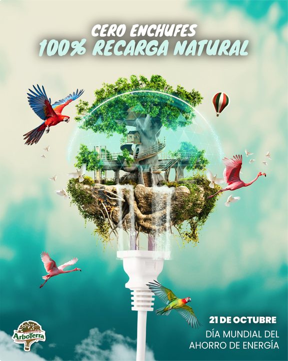
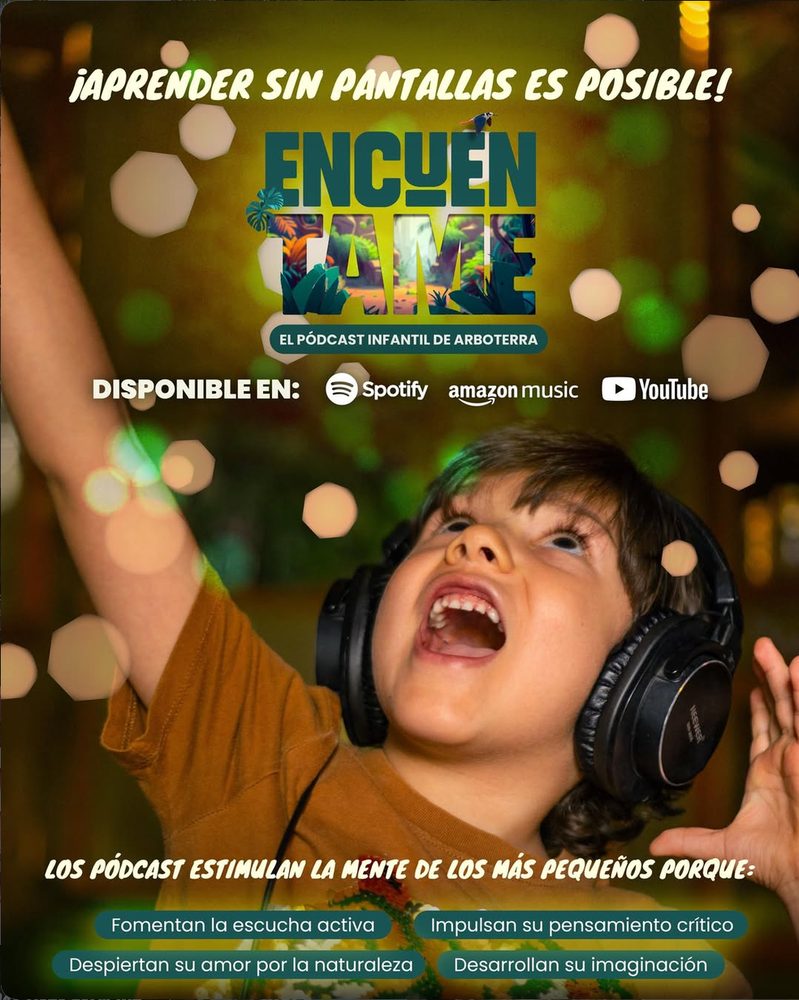
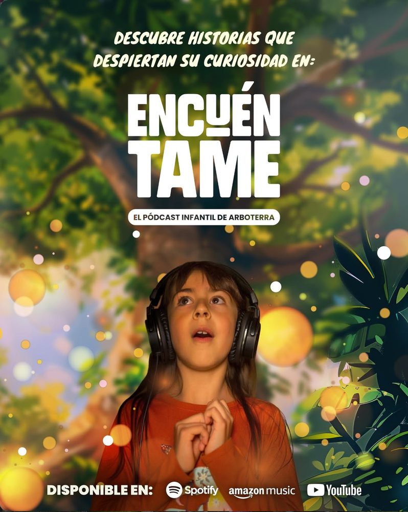
The tree, the lettering and #ArboTerraesMagia are still on the park’s Instagram, now produced by their own team.
The client wanted something timeless. These recent posts are made by ArboTerra’s in-house team, not by me. They’re here as proof the concept is still alive.
Give 3D the time it needs. A tree this complex in a few weeks was a stretch; today I’d prototype the scenes with AI before committing to the full model.
No Vendas Humo →